Architectural Cuts: How Geometric Citrine Redefines Everyday Elegance
Architectural cut citrine works best when it is read as structure, not spectacle. Its appeal comes from a clear outline, measured angles, and warm color working together: the geometry makes everyday jewelry feel composed, while the citrine tone keeps it from looking cold or overly formal.
That is the useful answer here. An architectural cut does not make citrine “better” by itself. In this page, the phrase is styling language for geometric citrine jewelry: pieces that use rectangles, steps, symmetry, sharp corners, elongated forms, or strong linear settings to create a more deliberate look.
The boundary matters. The available material for this page does not support claims about a stone’s origin, treatment, rarity, cutting performance, long-term wear, authenticity, or market value. So the question is narrower and more practical: how does geometric citrine change the mood of an outfit, and when does that structure feel elegant rather than overdesigned?
broader context
Citrine verification note
This narrower page works best after the broader citrine reference page.
What “Architectural Cut Citrine” Means
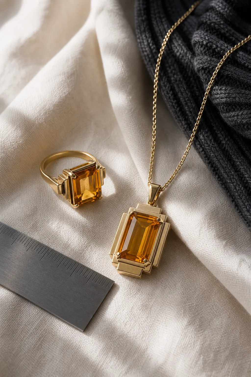
In styling terms, architectural cut citrine refers to citrine jewelry that looks built, balanced, and intentional. The word “architectural” points to proportion and line: a squared ring face, a stepped pendant, an elongated angular stone, a shield-like outline, or a setting that gives the gem a strong frame.
It should not be treated here as a formal gemological cutting category. A seller, designer, or writer may use “architectural” to describe a mood as much as a construction method. It can suggest a clean profile, visible planes, symmetry, or a modern jewelry cut with a strong silhouette. Those are visual cues, not proof of superior workmanship or stone identity.
Citrine’s role is warmth. Jewelry descriptions commonly place citrine in the yellow, golden, amber, or orange-brown range, but appearance alone cannot confirm a particular stone’s identity or treatment status. For styling, the important point is simpler: warm color softens strict geometry. A sharp outline that might feel severe in a colorless or very dark stone can feel lighter and more wearable in citrine.
That tension is the charm: architectural shape gives discipline; citrine color keeps the piece approachable.
Why It Works for Everyday Elegance
Everyday elegance usually depends on restraint. A piece should look intentional with a blazer, knit, shirt, dress, or plain tee without forcing the whole outfit to revolve around it. Geometric gems help because the eye understands their shape quickly. A rectangular pendant, squared ring, angular stud, or stepped earring acts like punctuation: clear enough to define the look, small enough to live with.
Architectural gem shapes also echo lines already present in daily dress. Collars, cuffs, watch cases, eyeglass frames, trouser creases, handbag edges, and belt hardware all carry structure. Geometric citrine can connect to those shapes instead of competing with them. The result is not always dramatic; often, it simply looks organized.
That is where structural design jewelry differs from sparkle-led styling. The impact comes first from outline and proportion. A slim angular citrine ring can make a white shirt feel more finished. A narrow pendant can add a vertical line to a crewneck sweater. Small citrine studs with a squared face can warm up workwear without breaking the quietness of the outfit.
The strongest everyday use usually sits between two extremes. If every element is sharp, glossy, and high contrast, the look can become rigid. If the clothing is too busy, the geometry disappears. One structured citrine piece against relaxed fabric, or one warm angular accent within a neutral palette, is often enough.
How to Style It Without Making It Heavy
A geometric citrine piece already carries visual weight, so the rest of the styling can stay calm.
Rings
For a ring, let the stone or setting be the main line. Architectural rings draw attention because the face of the jewel has a clear boundary. A plain band, slim watch, or bare wrist can keep the effect clean. If you stack rings, let the citrine piece be the shape with the clearest voice.
Earrings
For earrings, scale changes everything. Small angular citrine earrings can feel polished with tailoring, knitwear, or a simple black top. Larger geometric drops move closer to statement jewelry, especially when the setting is broad or the outline is heavy. They can still feel elegant, but they need more visual space around the face and neckline.
Necklaces
For necklaces, length and neckline matter more than ornament. A rectangular, bar-like, shield-like, or stepped citrine pendant works best when the outline remains easy to see. Plain fabric, a smooth knit, a buttoned shirt, or a clean dress usually gives the shape more room than a patterned neckline.
Bracelets
For bracelets, watch the amount of structure near the wrist. A single angular citrine accent can look refined beside one other clean accessory. Too many competing edges can turn structure into clutter.
A simple everyday formula
One geometric citrine focal point, one repeated shape elsewhere, and one softening element. A rectangular pendant with a square watch and a soft sweater. Angular studs with a tailored jacket and loose hair. A structured citrine ring with a linen shirt and minimal metal jewelry. The repeated shape makes the choice feel intentional; the soft element keeps it human.

What Changes the Look
Architectural jewelry styling is not one fixed mood. The same citrine piece can look minimal, bold, vintage-leaning, or formal depending on scale, contrast, metal color, texture, and personal style.
Scale
Scale is the first variable. A small geometric stone reads as detail. A large one reads more like a built object on the body. Both can be elegant, but they ask for different surroundings. Smaller pieces blend more easily into daily wear; larger pieces usually need cleaner clothing and fewer nearby accessories.
Contrast
Contrast comes next. Citrine against black, navy, charcoal, white, or cream often looks more graphic because the outline is easier to read. Against camel, beige, olive, rust, or soft brown, it may feel quieter and more tonal. High contrast emphasizes shape; low contrast emphasizes warmth.
Metal Color
Metal color also changes the mood, though it should not be used as a shortcut for quality claims. Visually, yellow-toned metal can make citrine feel warmer and more continuous. White-toned metal can make the geometry appear crisper. Darker or mixed metal may push the piece toward a stronger architectural mood. The better question is not which metal is “best,” but whether it supports the role you want: glow, line, or contrast.
Texture
Texture softens or sharpens the effect. Smooth fabrics make the geometry look cleaner. Ribbed knits, denim, linen, wool, and other visible textures make the same piece feel more relaxed. This is why architectural cut citrine can work well in everyday elegance: the gem shape can be formal while the outfit brings it back to daily life.
Common Misunderstandings
The first misunderstanding is that “architectural” means technically superior. In this context, it does not. It describes visual language: structure, proportion, line, and modernity. It should not be read as evidence of better cutting, greater value, stronger material, or authenticity.
The second is that geometric jewelry must feel cold. It can, especially when the shape is severe and the styling is highly controlled. But citrine changes that balance. The geometry gives the jewel composure; the warm color makes it easier to wear.
The third is treating statement and everyday as opposites. A piece can make a statement because its shape is clear, not because it is oversized. Architectural cut citrine can be everyday-friendly when the silhouette is strong but the scale, setting, and outfit stay restrained.
The fourth is reading style as verification. A clean geometric cut does not show whether a citrine is natural, treated, synthetic, or accurately represented. That belongs to gemological verification, not visual styling. If those details matter for a purchase, they require evidence beyond a photo, product name, or appearance on the hand.
The Practical Boundary
This page is intentionally narrow. It can discuss styling effects: geometric silhouettes, outfit balance, proportion, warmth, contrast, and modern jewelry mood. It cannot responsibly claim that an architectural cut improves brilliance, protects the stone, increases value, confirms origin, or proves treatment status.
For readers, the takeaway is simple: use architectural cut citrine as a style category, not a proof category. It helps describe a look—a structured gemstone, a warm geometric accent, a modern cut citrine mood, or structural elegance in jewelry. It does not answer technical buying questions on its own.
A Quick Styling Check
Use this before choosing a geometric citrine piece for everyday wear:
- Does the outline stay clear with your usual clothing?
- Is the scale comfortable for ordinary settings?
- Does the warm color support your wardrobe palette?
- Is there enough simplicity around the piece for the shape to be visible?
- Are you using “architectural” as style language, not as proof of gem quality?
If the answer is mostly yes, the piece is doing what architectural cut citrine does best. It adds structure without removing warmth. It turns a gemstone into a line, a proportion, and a small point of order. That is how geometric citrine can redefine everyday elegance: not by becoming louder, but by making ordinary dressing feel more intentional.