The 5500K Lighting Rule: Unlocking Citrine's True Golden Glow
A high-CRI, daylight-style light around 5500K is a useful target for viewing citrine, but it is not a magic number. The optimal lighting for citrine is better thought of as a stable viewing condition: neutral enough to reduce the orange push of warm bulbs, bright enough to show lightness and saturation, and consistent enough that two stones can be compared without the lamp doing too much of the work.
Under this kind of light, “golden glow” becomes easier to describe in practical terms: pale yellow, honey gold, brownish orange, smoky undertone, uneven zoning, or a washed-out look. What it does not do is prove authenticity, natural origin, treatment status, grade, or value.
What the 5500K lighting rule really means
The useful part of the 5500K idea is not that citrine has one official “true color” at exactly 5500K. The useful part is that neutral daylight-style lighting reduces some of the distortions that happen under very warm, dim, colored, or mixed light.
Citrine is a yellow to brownish-yellow variety of quartz. Its appearance depends on the stone itself, but also on the light falling on it and the conditions around it. Gems are not self-luminous; they show color by interacting with the light they receive. That is why color temperature, brightness, color rendering, background, and viewing angle all matter.
A practical version of the rule looks like this
- Use a neutral daylight-style lamp, roughly around 5000K–5500K, rather than a yellow household bulb.
- Prefer high color rendering, often labeled high CRI, because color temperature alone does not make a light source reliable.
- Keep the light steady and reasonably bright, not dim or theatrical.
- View the stone against a plain white, gray, or otherwise neutral background.
- Compare stones under the same light, at similar distance and angle.
That setup is enough to make color viewing more consistent. It is not enough to identify natural citrine, detect every treatment, assign a value grade, or replace gemological testing.
What 5500K can help you see in citrine
When people ask for citrine’s “true golden glow,” they usually want to know whether a stone still looks golden once flattering lighting is removed. A neutral daylight-style setup helps separate several visible traits.
Warmth
Citrine may appear lemon-yellow, golden yellow, honey-toned, orange-yellow, or brownish. Warm retail lights can push many yellow and orange stones toward a richer amber look. Neutral light may make that warmth look less exaggerated.
Saturation
Saturation is the strength of the color. Under dim light, a stone can look sleepy or muddy. Under warm light, it can look richer than it will in ordinary daylight. A consistent daylight-like light helps you judge whether the color itself is lively or whether the lamp is adding drama.
Lightness
Some citrine is pale and bright; some is deeper and darker. In everyday viewing, lightness is often the first thing the eye notices: does the stone look airy and yellow, dense and brownish, or dark enough that the center loses life?
Brownish undertone
Brown can be part of citrine’s appearance, but it can also make a stone look less cleanly golden. Warm light may soften or romanticize that undertone. Neutral light often makes it easier to see whether the stone is yellow-gold, orange-brown, smoky-brown, or unevenly toned.
Smoky cast or uneven zoning
A single lamp cannot explain the cause of a smoky cast or color zoning, but it can help you notice them. Rotate the stone slowly. Look face-up, then from the side. If some areas look deeper, duller, or patchier under consistent light, keep the observation descriptive.
That is the honest use of the rule: it improves what you can see and how clearly you can describe it. It does not turn the eye into an instrument.
Why warm, dim, and colored lighting can mislead
Citrine is especially vulnerable to flattering light because its appeal often depends on warmth. A yellow or amber-leaning lamp can make a modest stone look richer. A dim setting can hide weak saturation, windowing, or uneven tone. A colored light source can shift the whole impression away from what the stone would look like in more neutral conditions.
Warm lighting and citrine are not always a bad combination. Warm light can be beautiful for wearing jewelry in the evening. The problem begins when that lighting becomes the only basis for judging color.
A very warm bulb may
- make pale yellow citrine appear more honeyed;
- reduce the visibility of brownish or smoky undertones;
- make orange tones look more desirable than they appear in neutral light;
- create a “golden” impression that belongs partly to the lamp.
Dim lighting creates a different problem. It may make dark areas less obvious, but it also prevents the eye from seeing the balance between brightness and body color. A stone that looks romantically deep in low light may look dull or overly brown when examined in clearer light.
Colored lighting is the least useful for judging citrine color. Blue, pink, green, or display-tinted light can change perceived hue so much that the observation no longer belongs mainly to the stone. Treat colored light as decorative, not evaluative.
Mixed lighting is also unreliable. A stone near a window, under a ceiling bulb, and beside a warm display lamp is being lit by several sources at once. In that situation, it becomes harder to tell whether an orange flash, gray cast, or rich golden face-up color is coming from the gem or from the environment.
Is a 5500K daylight booth better than a lamp?
A 5500K daylight booth can be useful because it controls more variables than an ordinary room. It can reduce mixed light, keep the background more neutral, and make repeated comparisons more consistent. For someone comparing several citrines, that stability is the main benefit.
But a daylight booth should not be treated as a stronger claim than it is. The available source base does not establish an official citrine-specific standard at exactly 5500K. Some gemstone color studies use daylight references closer to D65, around 6504K, and controlled lighting ranges appear in other gem-color contexts. Those examples support the broader point that controlled, daylight-like lighting matters; they do not create a universal 5500K citrine rule.
For home viewing, the choice is simpler
- A daylight booth is more controlled.
- A high-CRI 5500K-style lamp is more accessible.
- A window can be useful, but daylight changes with time, weather, direction, and season.
- A jewelry counter may be attractive, but it may be designed to flatter color.
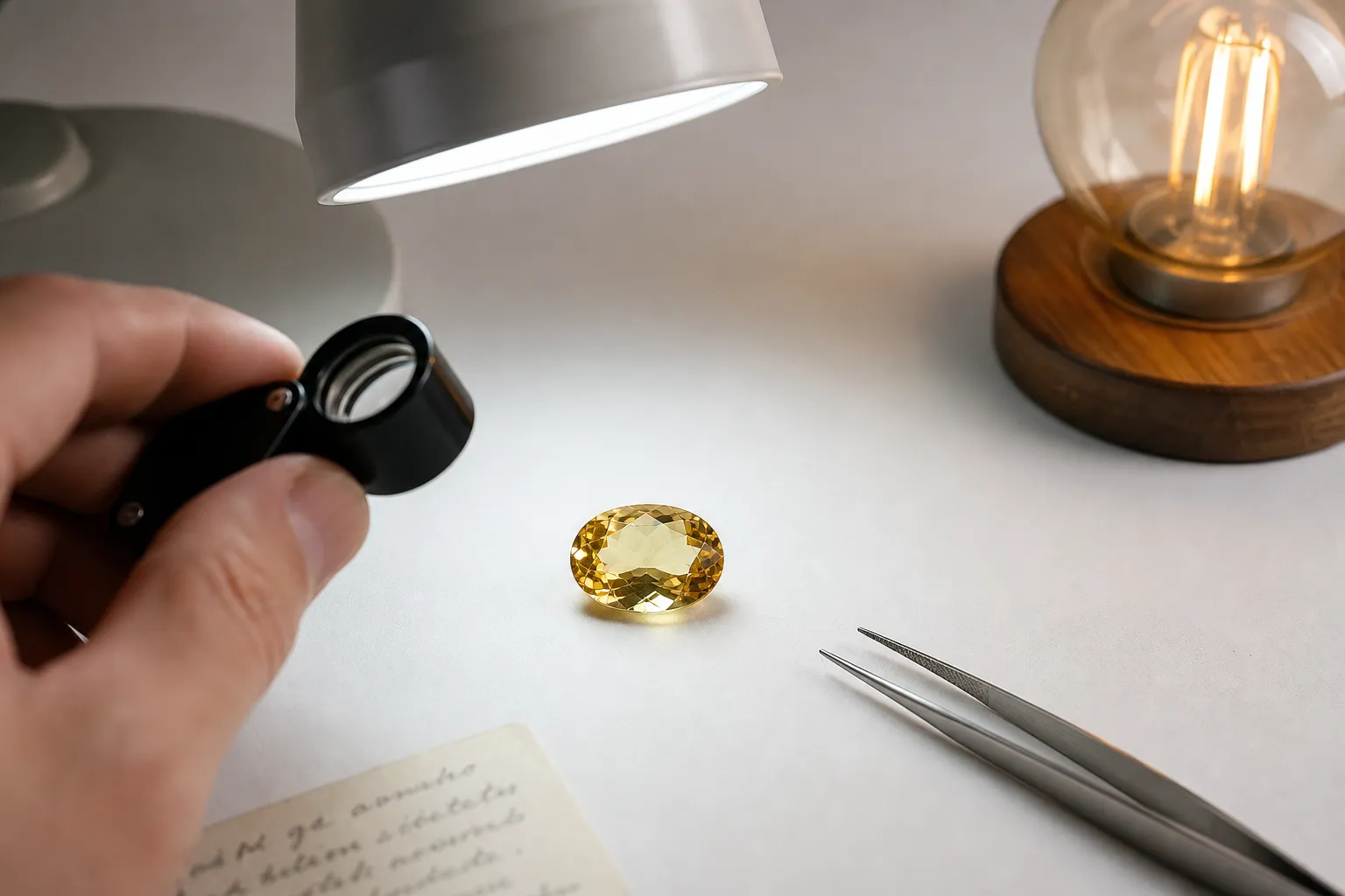
If you use a lamp instead of a booth, keep the setup plain. Turn off competing lights. Avoid bright colored walls reflecting onto the stone. Use a neutral background. Keep the stone clean. View it face-up and from a few angles. If comparing two stones, do not move one closer to the lamp than the other.
The goal is not laboratory color measurement. The goal is a repeatable visual setting that keeps the lighting from dominating the judgment.
The authenticity limit: lighting cannot prove what citrine is
This is the key boundary: 5500K lighting can help you see color more consistently, but it cannot prove citrine identity, natural origin, treatment status, quality grade, or value.
Many citrines in the market are associated with heat treatment, especially material produced from amethyst. Research on amethyst heating describes color changes toward yellow or citrine-like stages under high-temperature conditions, and quartz color phenomena involve impurities, color centers, growth conditions, and thermal stability. Those are mineralogical and treatment-related questions. They are not settled by looking at a stone under a neutral lamp.
A citrine may look golden under 5500K light and still be treated. A stone may look pale and still be natural. A brownish or orange appearance does not, by itself, identify origin. A consistent daylight-style view can raise better questions, but it cannot answer all of them.
Use lighting as a first-pass observation tool. Use documentation, seller disclosure, reputable lab reports when appropriate, and gemological testing for stronger claims. If the question is “Does this look too orange under neutral light?” 5500K can help. If the question is “Is this natural citrine rather than treated amethyst or another material?” lighting alone is not enough.
The same applies to value. Color is one part of how people discuss citrine, but value also depends on size, cutting, clarity, market context, origin claims, treatment disclosure, and documentation. A lamp cannot settle those factors.
Pleochroism, dichroism, and what not to overread
Searches around citrine lighting sometimes bring in terms such as pleochroism testing, dichroism, and natural citrine dichroism. These terms sound diagnostic, so they need a smaller claim.
Pleochroism refers to different colors seen in certain gems when viewed from different crystallographic directions. Dichroism is a two-color form of that behavior. Quartz-related amethyst-citrine color phenomena have been studied in relation to growth conditions, impurities, and color centers, and some technical literature discusses amethyst-citrine dichromatism. That does not mean a casual 5500K viewing setup gives you a reliable citrine pleochroism test.
For a non-specialist viewer, rotating citrine under consistent light can still be useful. It may show uneven color, extinction, zoning, windowing, smoky areas, or shifts caused by cut and viewing angle. Those observations should stay descriptive.
Useful
- “Under neutral daylight-style light, I can see uneven yellow-orange zoning.”
- “The color looks less golden and more brownish when warm lighting is removed.”
Too strong
- “Under 5500K light, this proves natural citrine dichroism.”
- “This lighting result proves the stone’s treatment history.”
Visual effects can come from optical direction, cut, thickness, inclusions, color zoning, lighting angle, background, and the observer’s eye. Without proper instruments and expertise, the viewing result should remain an observation, not a conclusion about origin.
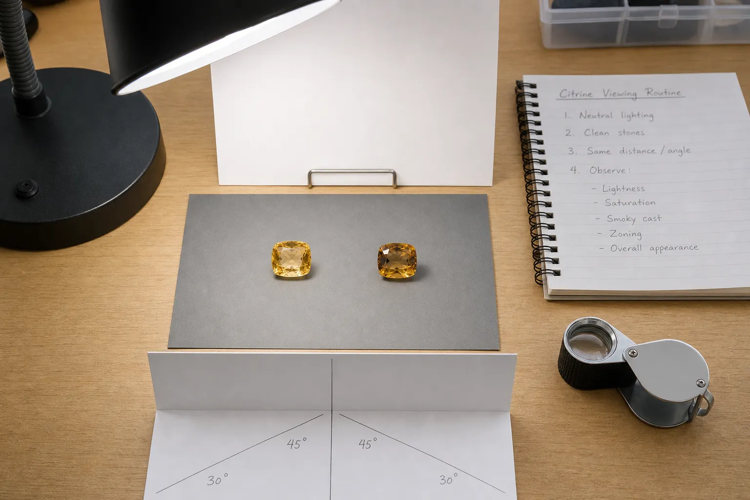
A simple citrine viewing routine
Use the same routine each time so the lighting stays consistent.
- Choose one neutral light source. Use a high-CRI daylight-style lamp around 5500K if available. Avoid warm decorative bulbs and colored display lighting.
- Control the room. Turn off competing lights. Keep the stone away from colored walls, bright clothing reflections, or mixed window-and-lamp conditions.
- Use a neutral background. White can make pale stones easier to see; gray can reduce glare. The key is consistency.
- Describe visible color traits. Note hue, lightness, saturation, brownish undertone, smoky cast, and zoning. Do not jump from “looks golden” to “must be natural.”
- Rotate the stone slowly. Notice whether color changes are broad and even, patchy, angle-dependent, or tied to the cut.
- Compare only under the same setup. If one stone is viewed in a shop case and another at home by a window, the comparison is weak.
- Separate beauty from verification. A citrine can be attractive under warm evening light. For judging color, return to the neutral setup.
This routine gives you cleaner language and fewer lighting illusions. It does not replace gemological verification.
The practical takeaway
The 5500K lighting rule is best understood as a disciplined viewing habit, not a citrine law. A neutral, high-CRI daylight-style light around 5500K can make citrine’s golden color easier to judge because it reduces the flattering effects of warm, dim, colored, or mixed lighting. It can help you notice whether the stone appears pale yellow, honey gold, orange-brown, smoky, or uneven.
The rule stops at appearance. It cannot prove authenticity, natural origin, heat treatment, quality grade, or value. Use it to see more clearly, compare more fairly, and ask better follow-up questions.