Citrine color zoning
Reading Color Zoning: Natural Geothermal Fades vs. Industrial Baking
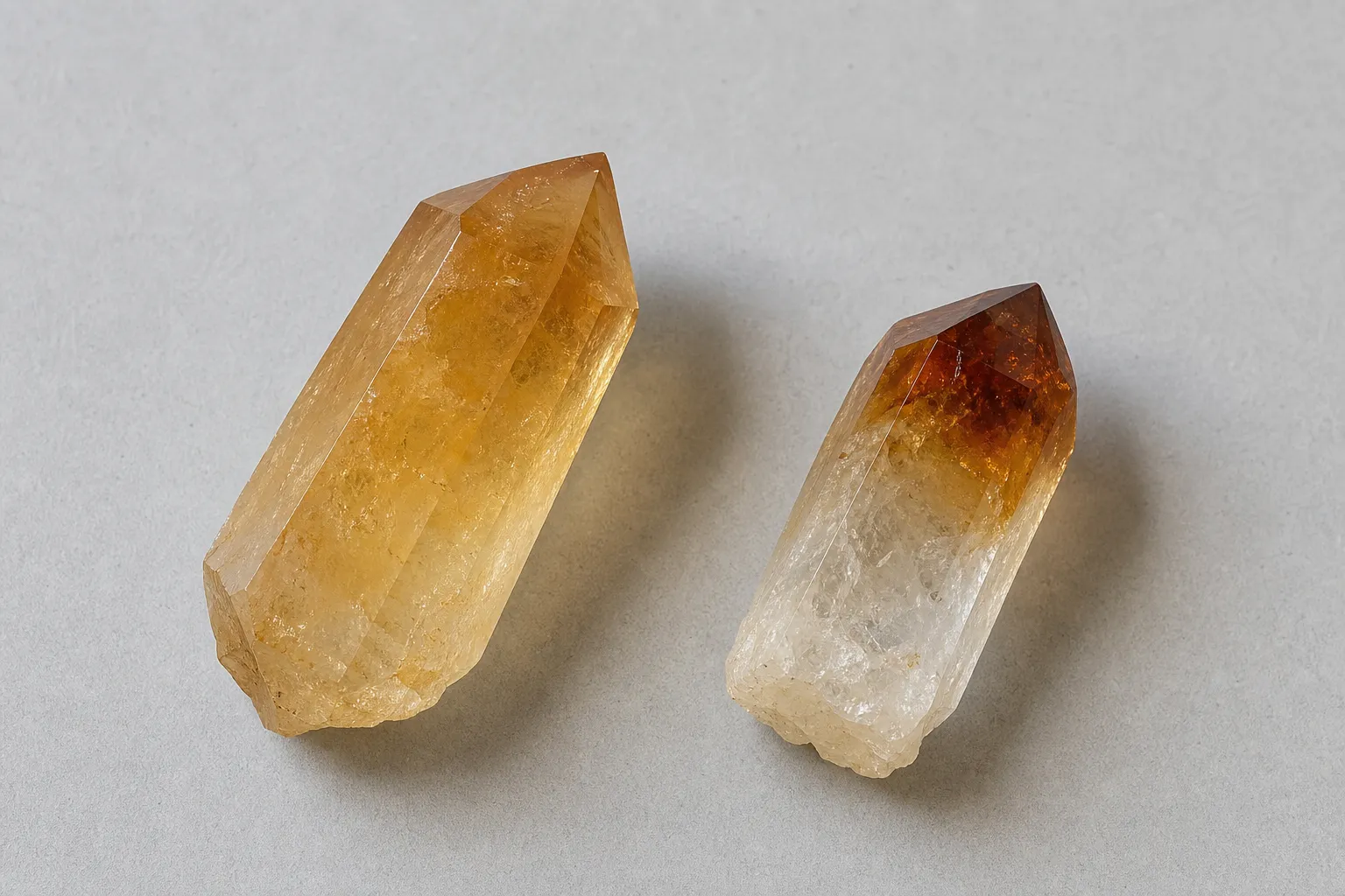
A citrine surface can point your attention in the right direction, but it cannot settle the origin story by sight alone. Citrine color zoning that moves as a smooth color gradient — pale yellow into honey, champagne, or soft gold — usually reads as more natural-looking than color that gathers abruptly at the tips. Dark orange-brown, smoky, or scorched-looking terminations deserve more caution, especially when several pieces in the same lot show the same tip-heavy pattern.
That is the useful answer. It is not proof. Macroscopic observation can help you name what you see: natural-looking fades, burnt-looking tips, tip-concentrated color, uneven bands, or patchy concentration. It cannot verify natural citrine, prove industrial baking, determine value, or replace qualified gemological evaluation.
broader context
Start with the main citrine page
This narrower page works best after the broader citrine reference page.
What Color Zoning Can Actually Tell You
Color zoning is the visible distribution of color across or inside a crystal. On a citrine point, cluster, bead, or cut stone, the color may look even, gently graded, banded, darker at one end, stronger around fractures, or heavier near the termination.
That pattern is worth noticing because it gives you better language than “real” or “fake.”
Smooth gradient
A smooth gradient is the easiest clue to describe without overreaching. The tone moves gradually from lighter to deeper yellow or golden brown, without a hard stop. The eye can follow the change through the crystal body rather than landing on one sharp border.
Burnt tip appearance
A burnt tip appearance feels different. The strongest color sits at the termination or outer end, often as darker orange-brown, reddish brown, smoky, or scorched-looking concentration. The piece may look pale lower down, then suddenly dark at the point. In a group, repeated dark ends can make the pattern more noticeable.
The word “clue” matters. Color can be affected by lighting, surface condition, cutting, photography, and expectation. A visible pattern is useful for screening; it is not a diagnosis.
Smooth Natural-Looking Fades
A natural-looking color fade usually has a calmer transition. The crystal may start nearly clear or pale yellow, then deepen into champagne, honey, or soft golden tones. The shift is gradual enough that you can trace it with your eye instead of pointing to a single line where the color changes.
This kind of observable color zoning can make a piece worth a closer look rather than immediate skepticism. It often matches what many buyers expect from natural citrine: lighter, subtler, and less saturated than vivid orange commercial material. Still, “natural-looking” describes appearance, not origin.
A cleaner way to say it is: “This piece shows a smooth color gradient that looks visually less abrupt.” That stays inside the evidence. It does not claim a geological history, locality, treatment status, or market value.
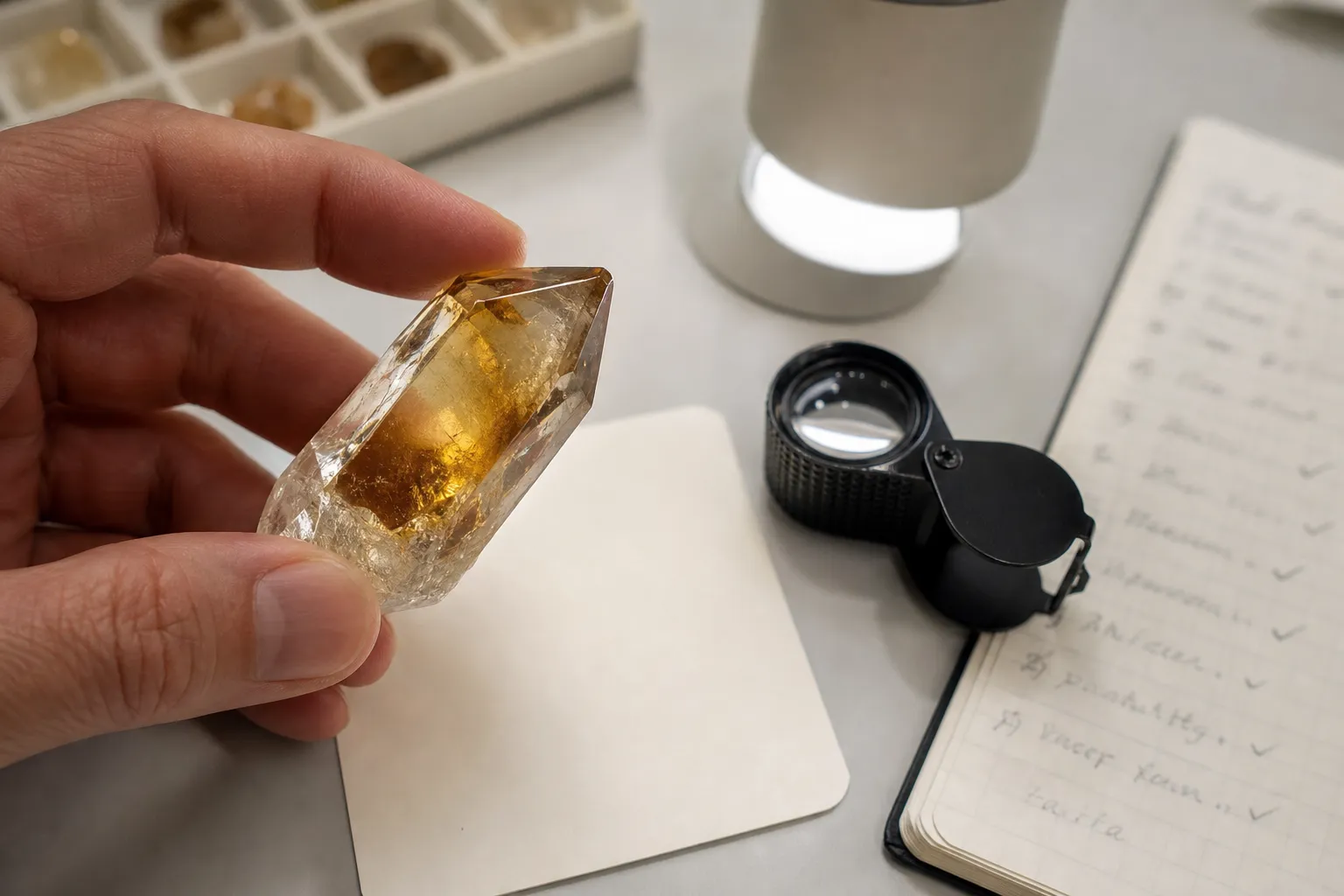
To examine a smooth fade, rotate the piece under neutral light. Watch whether the tone continues into the body or disappears with the angle. A loupe can help separate internal color from reflections, dirt, coatings, or surface staining, but it still keeps you in the visual-observation lane.
Burnt-Looking Tips and Concentrated Color
Burnt-looking tips draw attention because they look abrupt. The termination may be much darker than the base, with orange-brown, reddish, smoky, or shadowed color concentrated at the end. Sometimes the deeper color stops suddenly while the lower crystal remains pale, grayish, or clear.
This is where many readers jump too fast. A burnt tip appearance can raise a treatment question, but it is not a treatment verdict. The more disciplined reading is: “The color is tip-concentrated and visually abrupt, so I would not treat the seller’s natural-origin wording as settled without more support.”
In reader language, industrial baking usually refers to heat treatment applied to quartz material to alter or intensify color. This page should not turn that into a temperature chart or a visual rulebook. The practical point is narrower: some citrine-like material in the market is described in ways that make darkened tips, orange-brown concentration, and abrupt zoning worth questioning.
The strongest caution is not one feature by itself. It is the combination of very dark terminations, sudden concentration, repeated uniformity across many pieces, and seller language that asks the buyer to accept “natural citrine” without clear disclosure or documentation. Even then, the conclusion is uncertainty, not proof.
A Clean Comparison While Looking
Visible feature
More natural-looking fade
More treatment-questioning cue
Color transition
Gradual movement from pale to deeper tone
Abrupt shift or sharp concentration
Color placement
Appears more distributed through the crystal body
Heaviest at tips, ends, or terminations
Visual feel
Subtle yellow, honey, champagne, or soft golden tone
Burnt-looking orange-brown or smoky dark ends
Repetition across a lot
Variation from piece to piece
Many pieces with similar darkened tips
Best conclusion
Describe as a smooth gradient
Ask about treatment and disclosure
This table is not a grading system. A pale stone is not automatically natural. A darker stone is not automatically treated. A smooth gradient does not prove geological origin, and burnt-looking tips do not prove industrial heating.
The comparison simply gives you better wording for a buying conversation. Instead of asking, “Is this real?” ask, “Is this represented as natural-color citrine, heat-treated quartz, or another treated material?” If the seller cannot separate material identity from appearance claims, the visual uncertainty becomes a disclosure issue.
Common Confusion Around Citrine Zoning Clues
Subtle color is not automatic authenticity
Natural citrine is often imagined as soft yellow, so a pale or gentle stone can feel more believable. Visual softness alone does not establish untreated origin. Lighting, cutting, editing, and expectation can all make color look calmer.
Orange or brown is not an automatic treatment verdict
“Too orange” may be a useful caution in casual shopping, but it is too broad as an identification rule. Color intensity, zoning, and darkness can raise questions; they cannot carry the whole conclusion.
Product labels can compress different claims
Marketplace wording often compresses several ideas into one phrase: citrine, natural, heated, genuine, smoky, golden, raw, or cathedral. Some words describe appearance. Some describe shape. Some imply treatment or origin. They are not all gemological statements.
The cleaner reading is simple: visible color patterns can help you decide what to ask next. They should not be used to declare a piece natural, synthetic, treated, untreated, or valuable without stronger support.
When Visual Observation Helps Most
Macroscopic observation is strongest as triage. If you are looking at a listing, a tray of points, or a personal collection, zoning can help you decide what deserves closer attention. You can separate pieces with soft, integrated color from pieces with abrupt dark ends. You can also notice whether the color appears body-wide, tip-heavy, patchy, fracture-heavy, or unusually uniform across a group.
That is especially useful before a purchase. A seller who gives clear treatment language offers a better decision context than one who relies only on attractive photos. A stone with visual treatment uncertainty may still be appealing as a display piece or personal object, but color alone should not be used to support a natural-origin claim.
For cut stones, zoning can be harder to read. Facets, pavilion depth, reflections, and setting metal can concentrate color visually. With beads, strand arrangement, dye, coatings, and lighting can complicate the view. The smaller or more processed the object, the less weight a simple zoning read should carry.
For crystal points and clusters, terminations make the comparison easier. You can often see whether color deepens through the body or gathers at the tips. Still, visible structure is only the first layer. It does not provide a full origin history.
What Can Change the Answer
Better evidence changes the reading. Reliable seller disclosure, known treatment information, a gemological report, or documented source history can outweigh a casual visual impression. A beautiful smooth fade does not rescue a listing that uses vague or contradictory language.
Lighting changes the read too. Warm indoor light can make pale yellow look richer. Strong backlighting can make dark tips look less severe. Oversaturated product photography can turn ordinary zoning into dramatic amber. For a fair look, use diffuse daylight or neutral white light, place the piece against a white or gray background, and view it from more than one angle.
Surface condition also matters. Dust, iron staining, matrix residue, coatings, chips, and polish can shift apparent color. A darkened termination may be internal color, surface staining, shadow, or damage. A loupe can help you see whether the color seems inside the crystal or attached to the surface, but it does not turn the observation into final identification.
The claim being made is what raises the stakes. If someone says, “This is a golden quartz display piece,” color zoning may mostly affect taste. If someone says, “This is natural citrine with no treatment,” the same zoning becomes more consequential because the claim is narrower and needs stronger support.
Short Viewing Checklist
Use this checklist to keep the observation disciplined:
- Look for the transition: gradual fade, sharp band, patch, or sudden dark end.
- Locate the strongest color: body-wide, base-heavy, tip-heavy, fracture-heavy, or surface-looking.
- Compare repeated pieces: varied fades read differently from identical dark tips across a lot.
- Check the light: neutral light reduces the chance that warmth or glare is doing the work.
- Separate label from evidence: “citrine” on a tag does not settle treatment, origin, or natural color.
- Keep the conclusion modest: describe the zoning first, then decide whether more verification is needed.
That is enough for a reader-facing screening step. It is not enough for final identification.
Bottom Line
Smooth, natural-looking fades in citrine color zoning are generally less suspicious than abrupt, burnt-looking tips or strongly tip-concentrated color. They give you useful language for what the eye sees: smooth gradient, observable zoning, color concentration, or burnt tip appearance.
But visual clues are not proof. Color zoning can guide your next question; it cannot confirm natural citrine, identify industrial baking, establish value, or replace gemological verification. If the claim matters, ask for clearer treatment disclosure or stronger documentation before letting color carry the decision.